水平垂直居中
实现块元素百分比下水平垂直居中
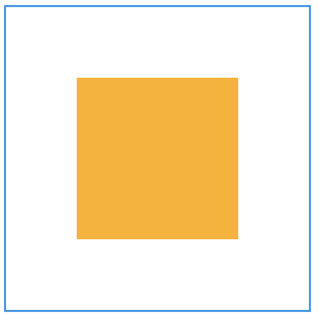
1.弹性布局方式
把父元素设置为弹性布局,设置水平和垂直都居中,其中的子元素就会水平和垂直都居中
.father{
width: 300px;
height: 300px;
border: 2px solid #0B97EA;
margin: 0 auto;
display: flex;
justify-content: center; /*水平居中*/
align-items: center; /*垂直居中*/
}
.son{
width: 160px;
height: 160px;
background-color: #FFB000;
}
2.平移方式
.father{
width: 300px;
height: 300px;
margin: 0 auto;
overflow:hidden;
position:relative;
border: 2px solid #0B97EA;
}
.son{
width: 160px;
height: 160px;
background-color: #FFB000;
position: absolute; /* 绝对定位 */
top:50%; /* 距离顶端50% */
left:50%; /* 距离左侧50% */
transform:translate(-50%,-50%); /* 往左、往上平移自身的50% */
}
3.多行文字垂直居中
.father{
display: table; /*1*/
background: #ccc;
width: 500px;
height: 400px;
}
.son{
width: 80%;
display: table-cell; /*2*/
vertical-align: middle; /*3*/
}
4.元素在整个页面水平垂直居中
<style>
body {
font-family: Arial, sans-serif;
display: flex;
justify-content: center;
align-items: center;
height: 100vh;
margin: 0;
background-color: #f0f0f0;
}
.content {
font-size: 24px;
padding: 20px;
background-color: white;
border-radius: 8px;
box-shadow: 0 2px 4px rgba(0, 0, 0, 0.1);
}
</style>
<body>
<div class="content">
好好学习,天天向上
</div>
</body>
 鲁公网安备 37110202000410号