茶饮网站
发布时间:2026-06-25 10:32
发布人:侯素玲
浏览次数:301
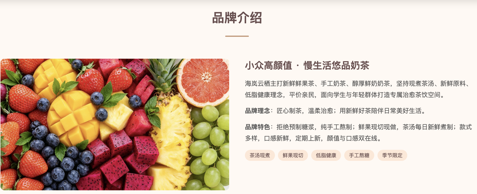
品牌介绍部分pc端效果
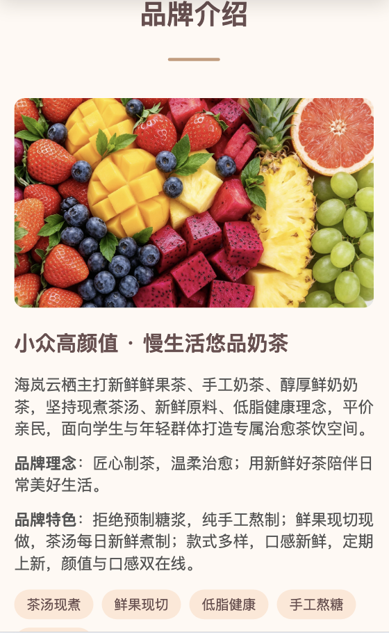
品牌介绍部分移动端效果
一、:root中定义CSS变量
:root {
--header-height: 60px;
--primary-color: #6b4f4f;
--primary-light: rgba(107, 79, 79, 0.8);
--container-max-width: 1200px;
}
/* 品牌介绍 模块- 移动端单列 */
.brand-wrap {
display: grid;
grid-template-columns: 1fr;
gap: 20px;
}
.brand-img img {
width: 100%;
height: 100%;
border-radius: 10px;
}
.brand-text h3 {
font-size: 20px;
color: var(--primary-color);
margin-bottom: 15px;
}
/* 品牌介绍 - 平板端2列 ,桌面端恢复间距*/
@media (min-width: 768px) {
.brand-wrap {
grid-template-columns: 1fr 1fr;
gap: 30px;
}
}
 鲁公网安备 37110202000410号